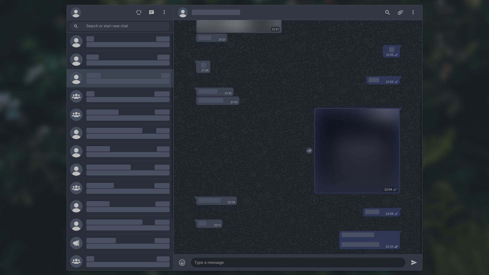
Next generation of Dark-WhatsApp
Drafted on Published on 976 words — 5 min read
Around 300 commits and three months of active development later, the v3 is here. It's some of my best work thus far, and I'm super-happy to finally release it.
# How it started
Everything began in v2.9.0 when a new update landed and broke a ton of things. I got tired of fixing randomized selectors and decided to switch over to CSS variables that were introduced a couple of months back. The switch wasn't done earlier because it wasn't certain whether they will stay or get scraped, and fixing selectors was still easier than refactoring everything.
In the same update, the very first generation of color generator that was used for background, foreground, and accent colors was released after two months of testing. This was a very welcome addition, and more work was done in later updates to further improve the procedural color generation so that colors look good across various edge-cases.
# A little bit of history
Honorable mentions go to v2.7.0 and v2.8.0 where we implemented lots
of hacks for fb-like message tails and custom theme intro image respectivelly.
In v2.10.0, the compact mode was ported to new code base. Parts of it were rewritten from the scratch, and I sort of figured out why a certain feature works the way it does (there was always an easter egg in the code in this area).
In v2.11.0, custom colors for incoming and/or outgoing message bubbles were ported, as well as fullscreen mode, custom app width, and blurred contacts.
In v2.16.0, WhatsApp finally released their native dark mode that was hinted in v2.2.0. I wasn't sure what to do, so I kept doing the same thing I was doing before.
Dark-WhatsApp — like most of my other themes — is more of an enhancement suite
than just a dark theme. There are over 50 customizable options that you can
play with.
I won't bore you any more with bits and pieces from the changelog, but these ones have screenshots or gifs that showcase functionality — similar to what can be seen on the UserCSS Configuration page in the project wiki.
# Color generator
I adore this feature. It's one of the most interesting things I've built with Stylus and CSS. Even though it took hours, and like a dozen of iterations before the first proper prototype was made, it was an awesome journey to craft something so out of ordinary.
If you'd like to show us what your DWA looks like, I made an issue that will act as a Screenshot thread. So, please, don't hesitate to show how you use your DWA. I'm very curious to see the color-schemes that people came up with using the procedural color generation as well as other features.
Small sidenote: I'll be making a separate blog post that dives deeper into how
color generator made with Stylus-lang works, as well as a GitHub template
repository for starting your own dark-* userstyles the easy way.
# Shell script
I'm also very happy about making this tool. It was just an idea for the longest time, and it turned out to be far simpler to implement than I anticipated at first. It helps so much when compiling Lite version of DWA, and it will also compile any and all UserCSS options so that you can have fully customizable custom builds for Ferdi, Franz, or whatever else you happen to use!
This is certainly going to come in very handy for ports to various desktop apps that you can see in the credits section of the project readme, or for other userstyles because the code is very modular.
# Thank you
To Erel, for doing so much work, testing, sharing ideas, and more, behind the scenes. I can't even imagine what DWA would have been if you weren't around.
To Raitaro, for helping me out with shell scripting and fixing some obscure bugs, and for testing lots of things.
To everyone that contributed in any way. It's hard for me to list everything, but I appreciate if you got in touch with me in regards to anything. I really do, and I hope that my work was able to inspire you and/or bring you at the very least a little bit of value.
# Closing words
This is a pretty big milestone for me. I'm not sure what else to do because all of the things are already implemented. My focus will be shifting mainly towards my other project that I announced around a week ago — userstyles.world — but that doesn't mean I'll be leaving DWA project or any other userstyle that I maintain.
However, my exams are coming up and I'm supposed to study. It kinda feels like a chore and I don't enjoy it, but I need to pass the exams, so my free time is going to be quite limited until the last week of September.